The Roku Channel Subscriptions
Connecting customers to premium entertainment

Roku had spent over a year developing The Roku Channel video streaming service, its first venture into licensing content. While the service was promising, through user research and consumer insights, customers had limited content choices causing issues around retention. To extend Roku's mission of connecting customers to streaming content they love, the Content Programming team began investing in subscription video-on-demand (SVOD). I was given the opportunity to lead the design for a new experience that enables customers to find, access, and purchase their favorite subscription-based content.
Partners launched
Revenue (2019)
Annual revenue boost
The team consisted of me, a user researcher, and a product designer. We spent significant time with product and user research to navigate constraints and opportunities, ensuring our design was feasible and didn't discard valuable insights during execution. To help gain alignment and to ensure we're on the right path, we facilitated multiple meetings with key stakeholders from our business, product, and engineering teams. Business goals and core themes were identified to help us measure the success of the design.
Business goals

After ongoing discussions, the teams' core ideas revised our existing product statement, guiding our decision making.
A video streaming service that offers:
in order to:
so that customers can:
I did an audit of the existing free experience. Our approach was to work with the existing framework to see if we can make incremental updates to the UI. This matrix helped the team understand the scope of new work, clarifying existing gaps.

With the content catalog significantly growing from 1k to 100k titles and the addition of 25+ content partners, we were really constrained on the current design. It was obvious that additions to the design system was essential to support a customers' subscription journey.

To help break down the project into manageable parts, our design sprints were centered around themes. In each theme, we started creating concepts and prototypes that support customers subscription tasks. A handful of our prototypes were user tested and findings were shared with executive leadership for feedback.
Awareness and Interest
How might users easily discover subscription content when launching The Roku Channel? I explored how a user can browse and find subscription content in several ways. This took many many reviews with Product, Marketing, Monetization, and Engineering teams. There were many discussions around tooling dependencies, branding subscription content, and how each concept could negatively impact ad revenue. Collectively we settled on a final direction after prioritizing the user and business impact with effort.
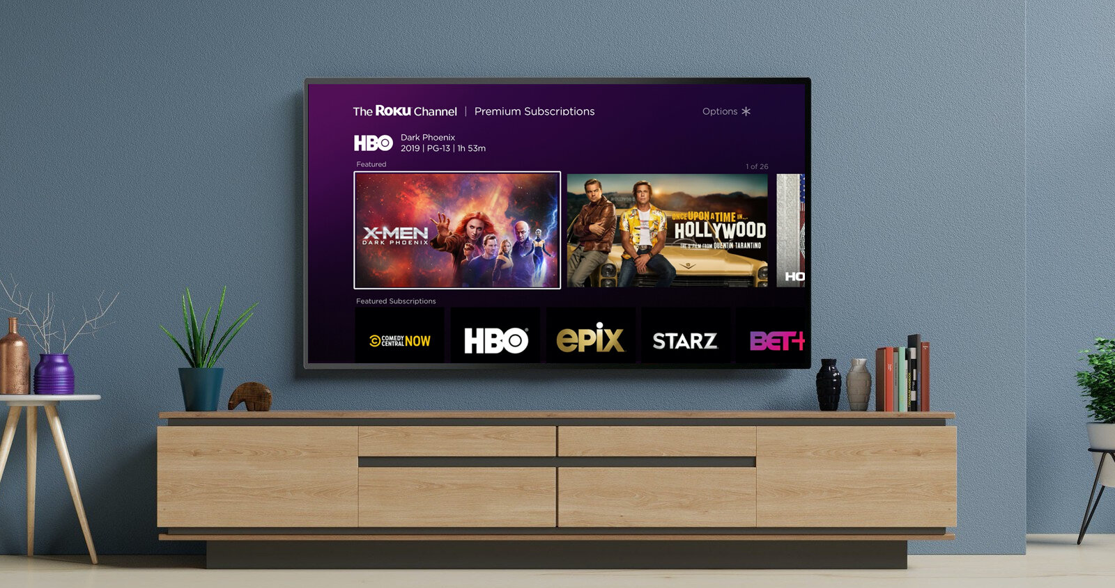
Concept 1: Carousel row of premium subscriptions
Highlights the most popular or featured subscription add-ons, pinned ten rows down on the home screen. Each app tile directs the user to the content partners landing page.


Concept 2: App navigation with subscription menu item
Introduces a navigation menu item exclusively for subscription content. Other items in the menu such as Home, Live TV, Search, and Categories, offer a combination of ad-supported and subscription content, with a greater emphasis on ad-supported options.


Concept 3: Carousel banner with subscription entry point
Redesign home screen layout and add a carousel banner above the content grid. The carousel items may contain a Premium subscription call to action that directs the user to the subscriptions landing page.


As we started honing in on the content organization and patterns, I built a prototype to help get alignment with leadership. The prototype helped communicate positioning of the subscriptions row for different user states, partners collections, and directional-pad interactions using the remote control.
Once I felt the direction was clear, I worked with the UX engineering team to build a tv prototype with real partner data for user testing. I project managed the TV prototype within our design team, tracking down API access, working with our UX Engineer and User Researcher to run multiple user studies.
Evaluation and Purchase
After conducting an audit of streaming app paywalls, I explored multiple design concepts for the paywall using priming to influence prospects decision-making. These explorations were user tested to understand pain points, information needed for a confident sign-up decision, and determining the best option for plan evaluation.


As we started narrowing on a paywall direction, I built another prototype to show how a user signs up for a subscription. Connecting my paywall designs with the Roku Pay checkout process created by the Payments Design Lead. This prototype helped drive discussions around content design, legal considerations like appropriate placement for terms and conditions, and whether to include annual plans at launch.
I contributed to the TV design systems by defining new components. Then further flushed out all the design details and edge cases for engineering execution. To support users with visual impairments or blindness, I defined accessibility guidelines for our text-to-speech screen reader on every new screen.

Content partner onboarding
A key part of this project is to ensure our other set of users, content partners, were successfully onboarded. I collaborated with Content Merchandising, Tooling, and Partner Management teams to define The Roku Channel design guidelines for partners to build their subscription channels. The guidelines included asset templates in Figma and Photoshop, as well as delivery instructions posted on the Roku’s developers website.

With the foundational design in place, Roku plans to carry out ongoing A/B experiments to evaluate future features:


